With three kids three and under, I am always looking for ways to keep myself and my family organized - which is no easy task. But some time ago I fell in love with The Container Store and frequent their website for ideas to accomplish this gargantuan task. I look forward to receiving their email because there is always something in there that ultimately helps me out - and in turn drives a purchase with them - their ultimate goal, I would hope. Recently I received a message that I was thrilled to open - the subject line was:
How to organize what's hot now!
Given my plight for organization I felt like they really knew me and were leveraging what they knew about my behavior to provide me exactly what I needed. Then I opened the message...
The Skunk
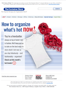
The message opens with a line stating, "You're a trendsetter." Ummmm....no. I have three small kids, unless juice stains are all the rage in Paris right now, I am the furthest thing from a trendsetter. But I do still like to keep my clothes looking nice, for the rare occasion I don something other than sweats and a t-shirt. So I move past the "trendsetter" label and take a look further to see how the trendy crowd keeps their clothes looking fabulous. But the only supporting image in the message is a shot of a t-shirt and a scarf. So now I am baffled - first is a t-shirt and scarf really setting trends this season? If so, maybe I AM a trendsetter after all! But my question is where is the product? It's not there, anywhere, see for yourself:

Just because you can stick any image you want in an email doesn't mean you should. Images in email should support the purpose of the offer and enhance the experience for the recipient. In the retail industry specifically, image usage typically exceeds best practice, but because it is a very visual and product driven market image-heavy messages still tend to perform very well. However, the images that are included are usually product shots or lifestyle shots that feature the product. This is neither, unless The Container Store recently started selling apparel and I didn't get the news.
The Resolution
I appreciate the approach, and the appeal to the trendy, with the copy of the message - but this could have been easily improved by including an image that demonstrated what really was hot in storing trendy clothes - like the puzzling image on the landing page that suggests you fold your white t-shirts and store them, individually, by day of week, in clear plastic letter trays that you would typically find in your office.
While I certainly don't have the time to be THAT organized - I found the out-of-the-box thinking refreshing and would have liked to actually see that in the email - instead of having to seek it out. The Resolution? Include images that support your message and feature your product!


3 comments:
You discuss about attach email images. If you facing any problem regarding this and want to Email Supportuse link and troubleshoot your Email Problems. thanks.....
I agree with your post about the wrong image in emails. To add a bit to this, I would say to also be wary of what I like to call "image-creep"... using too many images that confuse the core message. One image will draw and focus the subscriber's attention.
Cheers, Chris
I agree with your post about the wrong image in emails. To add a bit to this, I would say to also be wary of what I like to call "image-creep"... using too many images that confuse the core message. One image will draw and focus the subscriber's attention.
Cheers, Chris
Post a Comment